Today, I made a few ppt templates to suit my style.
Sometimes I mentioned it in my article, but I think I can say again that the direction that I'm pursuing is neat, that it's nice for people who look for glamour and neatness, and that it's easy to understand and it's easy to see.

The first and most basic and important thing that makes that possible is that I think it's about matching colors, and using them to unify, to maintain consistency in design and to decorate it like a pattern.
So I thought it would be right to give you information about the four main colors that are used primarily in the design of the ppt template.
The color I wrote today is also a blue color that I like. It's generally cooler and more comfortable to enter the eye. It's a blue color that captures both the image of trust and the lightness.
I can explain why we have the same bulu but two colors, and why gray colors, which are colorless, are divided into two because they are effective in table composition, in terms of content and in emphasis.

For the cover, I decorated it with the main color. It's a common expression, isn't it? I think it's the easiest, easiest, fastest way to make a cover of a ppt template.
However, the image itself was not used as it was, and the white shape was treated with gradation and the transparency value of each point.
It was for readability of the text written above.
It's not like the opaque treatment in the image effects, it's a way to capture feelings.

When you create a PPT template, the most important thing was that you couldn't organize and divide the presentation materials in advance because they didn't have any answers.
The reason why I don't think even if I make dozens of pages is significant in my case is that the composition will eventually depend on the content of my basic manuscripts, and that's why I always make only one or two pieces of paper because if I had one representative design, I would have to make a uniform template.

For this graph, the default chart of ppt is inserted.
If you've touched anything design, you've removed the basic label, the title, and you've made the quarter label, as you can see above, and you've put together.
Graphs The colors for each area are directly specified, and only the tones are aligned.
You got an arrow in there. ^^

I think I can tell you that the second page is probably not very unique, or that it's not a page composition or design.
The reason is that you make different things like this? It's not a bad idea, it's got a lot of icons, and you'll have everything you need to write down as a manuscript.
However, I think the individual thought that I wanted to convey through this was a sense of unity of color.
But it's also very difficult.
I'd like to name pretty colors. Everyone has it, but if there are two reasons why they look different, I think this is the color. And this is the same.
If you give me a tip when designing a ppt, I think you should avoid the original color.
It'll be easy to understand if you think about it even when you're walking on the street. Or, when I say that I buy clothes, you can think of my appearance and thoughts that judge by color.
So when you're walking down the street, say someone is going to wear a blue, red, or yellow T-shirt. I'm sure most of you are doing it.
But I don't think about it when I look at the colors that are toned down.
If the color of the colorful rainbow is basic, try to color it slightly lighter, dimly pastelton, or slightly darker.
Then it'll look different.
Never do anything as big as writing.
It's design-driven, but it's not very helpful to think about who's going to look at it.
That means all you have to do is stand out.
No one wants to read everything in the ppt presentation, hundreds, thousands of characters.

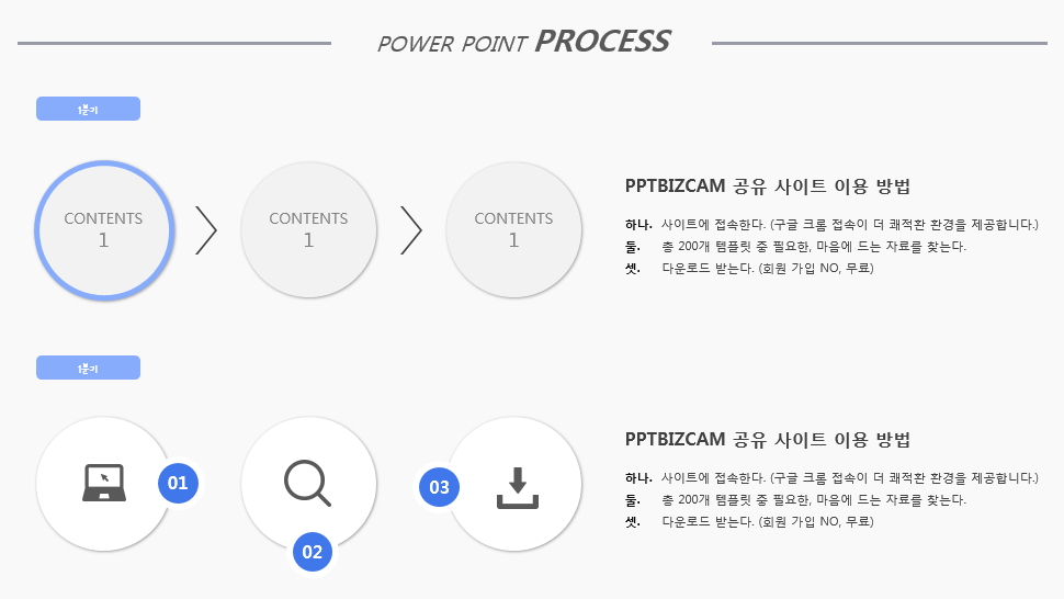
When it comes to images that are embedded one by one in the ppt template configuration, it's also a good idea to create your own label format.
Putting images in a circle or other shape may be the most convenient way to use them in future work, but I thought that the most convenient way to use them right away is to create a label, so I made this page as an example.

Anyway, it's simple today, but I've made a few ppt templates in the way I'm looking for them and anyone can make them.
I want to upload a shared file. ^^
댓글 없음:
댓글 쓰기