레이블이 ppt diagram인 게시물을 표시합니다. 모든 게시물 표시

2019년 3월 28일 목요일

3D smartphone ppt template, diagram How do we make it?

I want to make the design of the ppt template a little bit different, a little more unusual, so I want to make it stand out and catch my eye, and everyone has it.

There's no answer, there's a lot of different ways, but it's fun to make personally, and the results are good.

So, I think it's a way to use 3D formatting like 3D that you can't get tired of even a few times.

It's a concept that's been very popular even if you look at all the things that you've written. ^^


But one of the reasons today's pipettes look a little different from the previous ones is probably because of the difference in perspective and interpretation.

So far, when I've been using three-dimensional forms, I've just finished expressing the three-dimensional sensation as it looks.

That's what I thought.

And as if we're going to separate them one by one, and we're going to make a more interesting diagram and use

You don't get it, do you? So do I.

If you look at the work process and results rather than the white paper, it will be like that. Let's make it.


If you've seen a lot of 3D-feeling ppt that I've made, and if you've practiced them, you probably know enough about them without having to explain them.

For beginners, for those who haven't been to my blog, for those of you who haven't read, I'm going to give you a quick introduction.

First of all, put in the shape you want.

Tilt it through a three-dimensional rotation of the shape form, or lay it down.

The shape on the left changes to the right.

But this doesn't make you feel good, does it?


So you have to add extra effects to the upper or lower part of the macro three-dimensional form that you have to work with.

For example, in order for a square in a plane to become a cube, increase the height value, whether it is up or down.

Today, I'm going to make a cell phone shape, so the price didn't have to be that big.

And at the same time, we didn't have to do that much because we're going to make it look like the top and bottom are separated.


We've missed the middle, but if you put another square, black-colored shape on top of it, and you put it on top at the same rotation, you can make the display panel look like it.

Shall we make the lower part?

If you copy the shape that you made earlier, just apply the border, and it'll look like the bottom.

It doesn't fill up, it's just a line that needs to be

If it's the thickness you want, just increase the height value from the three-dimensional effect.


After all, it's never hard to design a ppt template that we're building today because it's a way to keep copying and pasting the first shape.

I wanted to use it as a diagram, so I just added some of the iconic label-type objects as a concept.


Shall I call it the basic prototype? It's for sharing, so I just painted it in monochrome or pattern.

In some cases, you can fill it with images, you can insert icons, or you can replace the icons you received with EPS with a three-dimensional format.


And it's a basic diagram, so you'll have to give us space, object, design to write down each one.

But in a ppt design, we don't have a ppt, so it's unfortunate that there's a line that's either straight-angled or completely wired.

It's a smooth curve where the deflection is, and the other line is a straight line.


Sometimes I want to do that, but if I don't, I have to make something. ^^;


So I used Wonho, two lines, and three lines to create that kind of explanation line.


It seems to be designed and expressed more smoothly.

It's a little bit too, but if you spend a little more time and a little more effort, your feelings will change. I don't think it's a big deal.

Anyways, today, I designed three-dimensional forms as main characters. I designed them in a different way.

This way, you can confidently post "My ppt is different" even though it's the same shape as the smartphone, right


After all, the design source and concept will reach the limit at some point, and there will be limited use, but I think it's a good way to get out of it and to get diversity out of it.


2019년 3월 26일 화요일

Create and share a very simple PowerPoint template

Maybe the office workers rarely work because of the end-of-the-way ceremony, or a day when they can't get their hands on the job.

It was actually like the last day of the year, and I wasn't paying much attention either.

So today, I'm spending a very simple time creating a free ppt template form, and I'm writing like this

Don't be surprised because it's simple and simple to write.


What do you call a general purpose, such as a table of contents, a graph, or a diagram? It's going to be a ppt template that can be used evenly, but the key shape I've used is a square with two corners that I've been using a lot lately.

The advantage of this is that you can divide the surface of the wound and leave it round on one side and just leave it on the other.

And it was perfect for what we wanted to make today, in shape.

I think it'll be okay to use this shape as a label.

Anyway, let's talk about it out


I wanted to put two shapes of the same shape together and express them in a concave way.

There are many ways to make that happen, but first of all, we expressed depth with gradation.

Color is what you want, but for each Gradient point, you can make a difference between light and shade based on the basic color and make it look like this.


If you cross the two objects that you've created in the same way, you create a ppt template that looks like this.

Isn't the color too colorful? ^^

I've done it with a stronger color.


And the second way is to add a shape and use it as an object that gives light and light, and the basic shape that we created earlier is to treat it as monochrome and put it on top.

I'm going to introduce you to this method.

There were a lot of people who said they couldn't handle the gradation well.

In the case of this method, the basics are Gradient, but it's easier to adjust with the same color and the value of transparency.


So, step by step, if you gradually increase or decrease the value of transparency, and you put it on the shape that's based on monochrome.


And the pre-scapture phase, and the original version that I'm putting up for free sharing, it's only on top of those shapes.

And in the first poem, I think I've used too strong a color. To tone down, I've done a raw image of the object at the top to make it easier for my eyes.

I like this more.

Let's wrap up today's introduction.


2019년 3월 20일 수요일

PowerPoint Design Chocolate Pie Shape

Sometimes I think that I'm making something weird, and when I think about it, I think I'm making something that's totally different from someone who's good at designing PowerPoint. ^^

He makes things so unusual that he doesn't know if he's dealing with papo or just drawing like an illustration.

I think you'll agree.


This is probably because when I create the PowerPoint theme, I find it around me, in my everyday life, and I choose it, and I actually make it.

Basically, it's a key factor that makes a difference between the things that we've seen a lot, the way we make things, and we think about it, and we're making things that are future-oriented and business-type. Regularization. How about a rule?

I'm used to it, and I would define it as a good power point.

But if you think about it, it's not fun to make and it's not fun to watch. ^^


It's not interesting, it's not interesting, it's probably a very dangerous part of PowerPoint's purpose.

If you think about it closely, the ppt you made is boring, but it's interesting to see the final presentation that students put up when they were working on a team project.


Personally, I like neat things and pursue them, but as a departure from time to time, I also like to make strange designs and fun themes like today.

The introduction was very long.

What did I make today? Ha ha.


My personal favorite is Montpellantong! I recently found out that his name is just Montpellant now. She changed it a long time ago because she said she would get fat if she ate it.

Anyways, it's so good. When I go to the mart, I buy a box of them. I eat a couple of them every time I'm hungry. Should I try this during the day? I was in a hurry to think that...


You're looking at everything. You're thinking about making PowerPoint while you're eating, right?


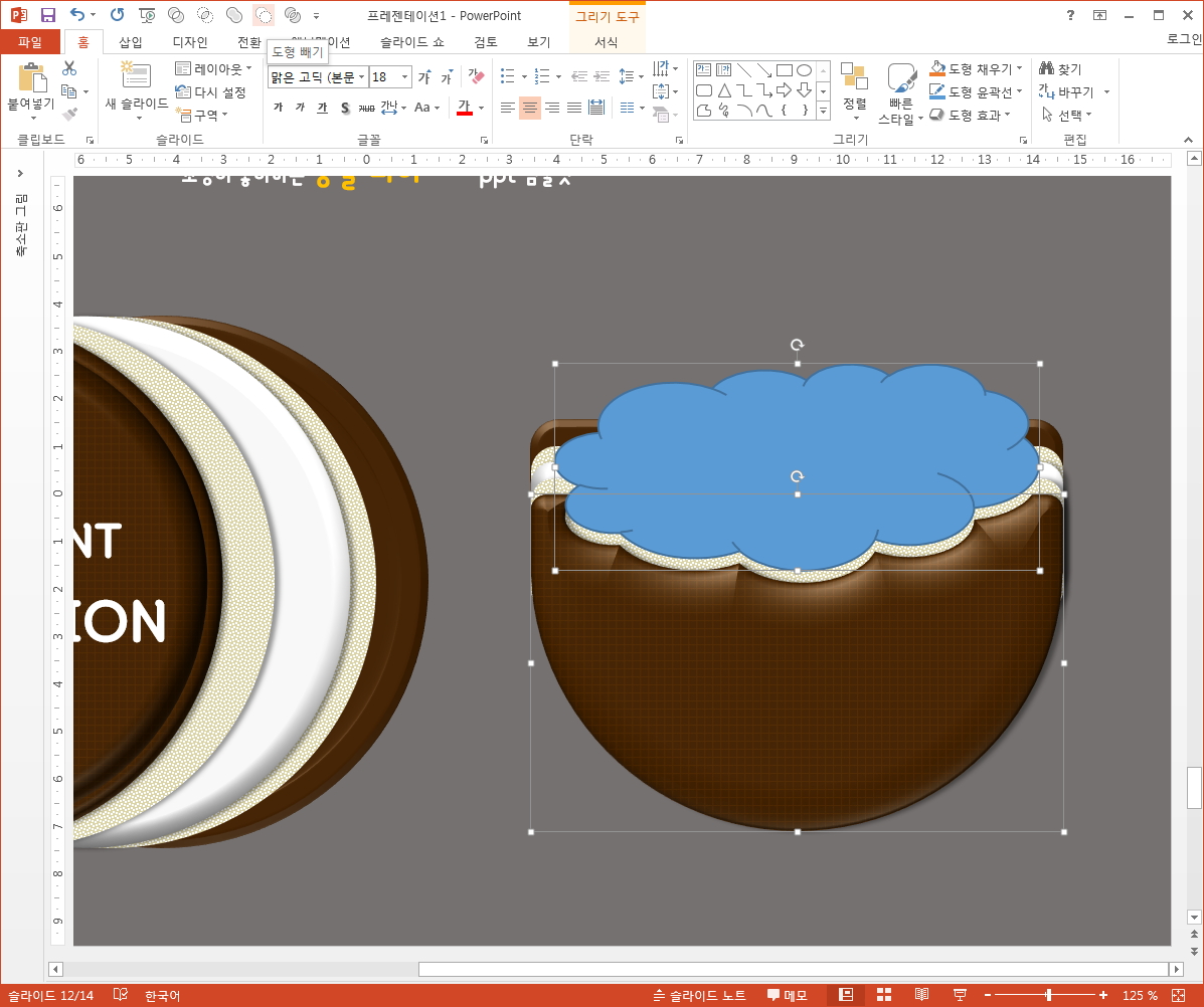
I think I'll have to look at the shape. So I took some pictures like this and made shapes with all the functions that I often use.

It was easy to make everything else. Should I call it adhesive? Should I call it the wing part? Anyways, it was hard to make and express that part, so I just gave it up.

If you look at the bottom, Ah~ You got rid of that. I think you can see it right away.


And I thought, "Let's design the PowerPoint." And I thought, "Let's design it." And I thought, well, I think I could use it as a graph, but it's not as expressive as I've ever imagined it before, so I ended up doing it like a diagram, like a regular form.

Oh~ I want to eat it again. ^^


If I start making one with PowerPoint, I'll take the basic form and make changes like this. But if you've seen a few of my writings, you know that.

And JOHN~ Like the picture on the top, I thought the side view was very attractive and funny. So I thought I'd try to express it again and use it as a cover.


In fact, it was actually a powerpoint design of this Montpellant theme, and we needed to find a way to make a difference or express it. But I think it's better to use only the open source I made instead of actively recommending that I go through a process that is too annoying.

So you'd better write it on the cover, on a table of contents or on a simple diagram. That's what I told you.

If you're going to use a circular graph, you'll need a problem like this, a troublesome process.

It's fun and charming to see a cross section of this design, but it should be comfortable if you treat it as a cover for a part with a different shape, but it also loses its appeal.


Anyway, I've made it like this way.


I tried it as a design theme with simple PowerPoint coverings, making it look like a big bite. ^^

But it looks like a chocolate pie and it looks like a mackerel.


Anyways, instead of making the same thing and the same mold, you can pretend to be crazy and make it fun.

The sauce could be right in front of my eyes.

If you're eating ramen, it's that, if you're drinking a can of beer. Give it a try.


2019년 3월 19일 화요일

Create PowerPoint Diagram with Genga Concepts

And one of the concepts that I've been thinking about, you know, you know, I've got to make a PowerPoint diagram, and I've been thinking, "Jenga, a kind of board game.

When I tried to make it weird, I thought of something else, and I made it first, and I couldn't actually put it into practice.

Finally? Anyway, I'm going to make it.


The reason I thought about this concept is because I love playing with shapes. 

I enjoy expressing it in a three-dimensional sense, which is the easiest and most representative of it.

Because when I think of what I can make, it's this Jenga form that I've been thinking about for a long time.

Above all, just think about it and open PowerPoint, and you'll get the size, right? I think we can make it and express it like this.

You can transform the cube into a horizontal and vertical shape and continue to pile it up. Fill it with a wooden image. That's exactly what I came to.


I think the process and the results are just above it.

But when you fill the cube with pictures, I recommend you find the image, get it, and fill it up with a drop in capacity or quality.

The reason for this is that the PowerPoint file itself is getting a little heavy, and it gets bumpy.

That way, if you make a few copies, not one or two, of course, the size of the file itself will grow.

I'd like to recommend you to reduce your capacity through R.C. or Photoshape. I'd like to tell you that it would be convenient for you to do so in the future.


And the other thing is, I've been doing this jenga, and I've done this before, and I've done this before, when I' 

I'm trying to capture the features that can be seen there by looking at the image data.

At first, I used a wooden image to make this, so I couldn't tell the difference.

So when I looked at the pictures, I noticed that the colors and patterns of the horizontal stack and the vertical stack were different.

So I decided to fill it up with two different pictures of trees, and that's how I feel.


So I'll make a set of 3x3s, stack them up, and assign shadows.

For your information, when you make a copy, you have to put it on top to cover the lower object.

If you paste from top to bottom, don't forget to add from bottom to top, as we need to add an extra layer to the back.


When I design PowerPoint, it's a shadow that I'm going to put in almost always, because it's going to be a little bit more realistic than a painting.

It's because of my experience that even when I actually made it, it made me feel more full.

In this form of multiple populations, like Jenga, we needed to create a separate shadow.

As you had expected, we added one shape, placed it back, and worked on it. If you treat the color the same as the PowerPoint background color, you won't get hung up.


Today's data that we've created in this way can be taken out and used as a diagram, just like

It's not much, but it's just fun. ^^


When it comes to sharing, we're going to upload it while maintaining the basic Jenga style.

So when you're actually writing to your data, you can take out each object you want and write down or organize the contents of the design.

Or just take the pieces of wood and put them back in the void.

You can use that empty space as a point area to organize the contents and proceed with the PowerPoint design.


In fact, one of the reasons why I wanted to create a template for Jenga was that I thought it was a lot bigger and wider to use than I thought.

I think I can use it as a graph.

It could be used to organize things that are related to goals and steps.

When I think about this, I think it's a theme that fits the meaning of it in a variety of ways.

It's easy to make, but the Jenga PowerPoint template is very appealing, right? ^^