2019년 3월 31일 일요일

I don't really use black on the powerpoint background, but..

Personally, I don't use black color as the main color when making power point backgrounds, but there are a lot of people who ask questions and ask questions. I'm going to make some of them this week, including today.

The reason why I don't use the black background is because if I make it well, the page that is more cool and reliable than anything else is complete, but if I make it wrong, it becomes too dark and heavy. And I write down the details and it's a bit difficult to organize.


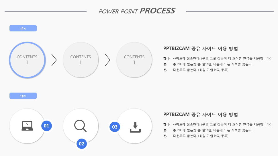
Rather than blacking out the background color of PowerPoint's slide, I wanted to use bright gray tones to make it look brighter and lower.

I just put a rectangle on it, but it's a lot of pressure. I can't breathe. It's like it's clogging up.


The color of the white, yellow, orange, etc. will make it brighter and offset this feeling, but I'm personally afraid of making it. L
Even though the same black language might not be visible, I did specify both because it would look different if I added gradation or patterns rather than monochrome.
PowerPoint can only color the shapes, so we put a pattern on it and put an object on top of it that was treated with a transparent gradient. 
Ah!! What I'm going to make today.
I'll say I like it too. I'll try to make a notebook that you liked a lot in the past.
I wanted to make it a little bit, a little bit different.


I took the spring shape that I had made before, but I thought I'd try again this time.
At that time, we just made it out of square shapes and gradients, but today we made it out of arcs.
If you just put one side in like this, it's kind of stuck inside, and it's done.
To make that shape appear, you can reduce the object's vertical height like an ellipse, not a complete circle.


You can put two or three of them in a single set, and you can put in a shadow to express the shape of a spring that looks like it's coming up.
It looks like a hole. You just have to do it thicker than the black color with the basic power point background.
I think you can also designate the shadow inside.


Anyway, I made a PowerPoint background template with black color.
Personally, I think I always have that idea.

"I don't know why I can't handle all the slide areas with all the blackness."
I'm sure some of you agree with me, so I think it's a background color that you didn't use very well.
I think the way to weaken that image or impression is to add a design source or structure that distributes our eyes a little bit more like today.


If you didn't put the spring shape in the middle of it as a design source, and you didn't process the black background on one side, and you divided the layout into two, which is a burden to the black background. I think it's a factor that can weaken that part.
I'll make another PowerPoint template as early as tomorrow or this week.


그리고 요즘 저희 allaboutppt에 와보신 이웃 분들중에서 보신 분이 계신지 모르겠는데, 파워포인트 자료 외에도 좀 도움이 될 수 있는 자료들을 남겨놓으려고 하고 있습니다. 특히 그 동안 폰트에 대한 질문도 많이 주셨던지라 일단 1차적으로 무료 폰트에 대한 정보를 정리하려고 하거든요.
이번주까지는 한번 끝내보려고 노력중에 있구요.


아무튼 학생들, 그리고 직장인분들께 도움되는 다양한, 많은 정보들을 꾸준히 담아놓을 수 있도록, 담고 있는 그런 공간으로 성장할 수 있도록 노력하겠습니다.


2019년 3월 28일 목요일

3D smartphone ppt template, diagram How do we make it?

I want to make the design of the ppt template a little bit different, a little more unusual, so I want to make it stand out and catch my eye, and everyone has it.

There's no answer, there's a lot of different ways, but it's fun to make personally, and the results are good.

So, I think it's a way to use 3D formatting like 3D that you can't get tired of even a few times.

It's a concept that's been very popular even if you look at all the things that you've written. ^^


But one of the reasons today's pipettes look a little different from the previous ones is probably because of the difference in perspective and interpretation.

So far, when I've been using three-dimensional forms, I've just finished expressing the three-dimensional sensation as it looks.

That's what I thought.

And as if we're going to separate them one by one, and we're going to make a more interesting diagram and use

You don't get it, do you? So do I.

If you look at the work process and results rather than the white paper, it will be like that. Let's make it.


If you've seen a lot of 3D-feeling ppt that I've made, and if you've practiced them, you probably know enough about them without having to explain them.

For beginners, for those who haven't been to my blog, for those of you who haven't read, I'm going to give you a quick introduction.

First of all, put in the shape you want.

Tilt it through a three-dimensional rotation of the shape form, or lay it down.

The shape on the left changes to the right.

But this doesn't make you feel good, does it?


So you have to add extra effects to the upper or lower part of the macro three-dimensional form that you have to work with.

For example, in order for a square in a plane to become a cube, increase the height value, whether it is up or down.

Today, I'm going to make a cell phone shape, so the price didn't have to be that big.

And at the same time, we didn't have to do that much because we're going to make it look like the top and bottom are separated.


We've missed the middle, but if you put another square, black-colored shape on top of it, and you put it on top at the same rotation, you can make the display panel look like it.

Shall we make the lower part?

If you copy the shape that you made earlier, just apply the border, and it'll look like the bottom.

It doesn't fill up, it's just a line that needs to be

If it's the thickness you want, just increase the height value from the three-dimensional effect.


After all, it's never hard to design a ppt template that we're building today because it's a way to keep copying and pasting the first shape.

I wanted to use it as a diagram, so I just added some of the iconic label-type objects as a concept.


Shall I call it the basic prototype? It's for sharing, so I just painted it in monochrome or pattern.

In some cases, you can fill it with images, you can insert icons, or you can replace the icons you received with EPS with a three-dimensional format.


And it's a basic diagram, so you'll have to give us space, object, design to write down each one.

But in a ppt design, we don't have a ppt, so it's unfortunate that there's a line that's either straight-angled or completely wired.

It's a smooth curve where the deflection is, and the other line is a straight line.


Sometimes I want to do that, but if I don't, I have to make something. ^^;


So I used Wonho, two lines, and three lines to create that kind of explanation line.


It seems to be designed and expressed more smoothly.

It's a little bit too, but if you spend a little more time and a little more effort, your feelings will change. I don't think it's a big deal.

Anyways, today, I designed three-dimensional forms as main characters. I designed them in a different way.

This way, you can confidently post "My ppt is different" even though it's the same shape as the smartphone, right


After all, the design source and concept will reach the limit at some point, and there will be limited use, but I think it's a good way to get out of it and to get diversity out of it.


2019년 3월 27일 수요일

Focus on color to design PowerPoint themes

If there's one thing I often tell you when I'm talking about PowerPoint template design,

In your everyday life, you're especially interested in the colors of the images you see on the web. It helps you improve your design completeness and quality.

The reason I'm telling you this is

In fact, the way we organize our content in detail while making ppts, the layout, the diagram, etc.

Because that's where I think there's a certain limit to having a clean, pretty design and diversity.


When you see a real school or company party, the way I make it and the way it's made by others, it's pretty much the same.

It's similar in content, so it doesn't go beyond a certain range.

Even if you look for a different way of expression, you can't afford to spend your time and effort thinking about it.


So I think I can finally compress the candidate for the best alternative, the best way to do it.


One is a photo and one is a main color choice.


And that pretty, neat color will be able to come up with a cell phone right now, sit in front of the computer, and look at the site where you can introduce your favorite clothes, products, and services.


Naver's main color and gradation color will be an example.


The PowerPoint theme that I created today is a version of Xi'an's color on the web.

Everyone can get that kind of feeling, right?

It's pretty~ It's neat~

I think the power point design completeness and the overall atmosphere will be further enhanced just by using the color that corresponds to the common sensibility, reference and apply in common.


The details and composition of today's templates are also common forms.

But I think we can expect and get different effects because of the image that colors bring.

If you just put a graph and wrote and put an icon on a white slide background, you wouldn't get the impression that it's so special.

But by referring to the colors you choose on the Internet and applying those colors to templates, we can make a theme simple for you to deliver different images.


Well, these days, there's a lot of capture programs and you can get RGB color information from the PG, so you won't have a problem.

If you take the finishing point from Al, you get color information at the bottom.

First of all, PowerPoint 2013 version has a spoiler like Photoshop, so you bring the captured photos to the slide, and you extract the color right away.

It can be applied to all objects, such as shapes, backgrounds, lines, and so on, so I can easily capture pretty colors in my pipette.


Still~ I just followed the basics. It's a bit sad to finish today's data. I'm not guilty of doing nothing. I've made a new one.

First, we filled the background with pictures, put a square on it, and put another shape on it as a freestyle shape.

If you take these two out, they'll change the top shape to a zigzag shape, like a graph.


If you use the main color, gradation, and transparency for background processing, you will be able to complete a page of PowerPoint templates that may look a little special.

What's important here is to keep the key colors uniform.


If the content doesn't mix with the overall atmosphere or the readability is going to be significantly impaired, I think it'll be a simple solution if you create an additional white area like this.


I don't want to look like a square!

If you think you didn't do anything. If you don't like it because you don't have a design element, just change the shape.

Or place the same white shape of the rounded label shape on the bottom of the white rectangle.

It's different how you feel. ^^


The easiest concept of design is, I think, just personal.

Add or subtract, increase or decrease it.


A simple example would be the size of your handwriting, and it would be nice to see, read, and not necessarily big. ^^


Anyways, I think I got a similar color today while looking at the sky full of fine dust.

The color was so noticeable that I made a simple PowerPoint template using it as my main color.

I'll share it in less than 10 minutes.


2019년 3월 26일 화요일

Create and share a very simple PowerPoint template

Maybe the office workers rarely work because of the end-of-the-way ceremony, or a day when they can't get their hands on the job.

It was actually like the last day of the year, and I wasn't paying much attention either.

So today, I'm spending a very simple time creating a free ppt template form, and I'm writing like this

Don't be surprised because it's simple and simple to write.


What do you call a general purpose, such as a table of contents, a graph, or a diagram? It's going to be a ppt template that can be used evenly, but the key shape I've used is a square with two corners that I've been using a lot lately.

The advantage of this is that you can divide the surface of the wound and leave it round on one side and just leave it on the other.

And it was perfect for what we wanted to make today, in shape.

I think it'll be okay to use this shape as a label.

Anyway, let's talk about it out


I wanted to put two shapes of the same shape together and express them in a concave way.

There are many ways to make that happen, but first of all, we expressed depth with gradation.

Color is what you want, but for each Gradient point, you can make a difference between light and shade based on the basic color and make it look like this.


If you cross the two objects that you've created in the same way, you create a ppt template that looks like this.

Isn't the color too colorful? ^^

I've done it with a stronger color.


And the second way is to add a shape and use it as an object that gives light and light, and the basic shape that we created earlier is to treat it as monochrome and put it on top.

I'm going to introduce you to this method.

There were a lot of people who said they couldn't handle the gradation well.

In the case of this method, the basics are Gradient, but it's easier to adjust with the same color and the value of transparency.


So, step by step, if you gradually increase or decrease the value of transparency, and you put it on the shape that's based on monochrome.


And the pre-scapture phase, and the original version that I'm putting up for free sharing, it's only on top of those shapes.

And in the first poem, I think I've used too strong a color. To tone down, I've done a raw image of the object at the top to make it easier for my eyes.

I like this more.

Let's wrap up today's introduction.


2019년 3월 25일 월요일

Create fingers and tablets in ppt shapes to design PowerPoint themes

These days, I think I use a lot of power point materials.

It's probably true now, but it's like there are a lot of cyanide coming out of the advertising contest that we used to participate in a lot in college.

But today, I wanted to make a shape that I couldn't find as an icon if there was a difference.

No matter how much data we provide from a variety of subjects, such as flat icons, we're looking for something to use as a main theme, not just as a small source, but sometimes we don't.


If you're frustrated, if you want to, you have to make it yourself. What?

I always start creating PowerPoint themes by looking at colors and expressions, showing the shape of a finger that I want to make in front of my eyes, and then putting some of the same basic shapes.

Most of them are circular, round-edge objects.


If you need more curves or if you don't have anything like them, you're going to use


A few days ago, a blog follower wrote a PowerPoint only for Illustr, but he left a comment saying that he was surprised to see you making it like this way.

Sometimes I mention it in my article, and I'm not really good at the illustration, but the basic concept itself, and the function is that sometimes it's more comfortable to draw in the shape you want in the illustration.

Of course, there are limits, but I don't think there's a shortage in trying to make the template work.


So, I don't know what the name is, but I've made both the thick parts of my thumb, the wrist and the fingernails, using point editing and free drawing.

If you look at the icons, they're more realistic these days through

So I got a good color. I picked the color as a spoiler and applied it.

But the index finger is a bit awkward.

I think you can just treat it the same as the color of the thumb, or subtract it a little or darken it. L


Anyways, I made a finger shape for the PowerPoint theme. Make one right or left, and then you can mirror the rest to the left and it'll be simple, right?

He doesn't know if he's writing about illustration or how to draw with papo. Well~ I'm personally acknowledging that. ^^

But it's a reincarnation. I like it so much. I usually make it like this.

I think it would be better if you could get a unique and distinctive template instead of the same template every time.


Okay~ It's done~ I just made my own tablet.

There are a lot of open sauce, so you can just take it and use it.

I'm tired of making hand shapes, so I just put in some old stuff. ^^


I'm gonna make it into a one-pun shape and... But since the size has changed, I think I can use the extra space.

If it's not necessary, you may want to keep your left hand and hand in shape while maintaining a clean power point background.

I thought I could find an icon of the shape I wanted and make it easier, but I couldn't find it.

Considering that the time it took to find it was more invested than the time we made it ourselves, we'll have to make something unusual and something that we don't think will exist.


You can use it as a PowerPoint template by changing the finger spacing, location, and shape and size of the device.

Of course it can be used as a cover.

I've increased it. I've narrowed it down. I've changed the location. But as a theme, I think I can organize my content while keeping my core design intact.


2019년 3월 24일 일요일

ppt infographic using wrist watch icon

I mentioned it briefly in yesterday's article, but I designed a PowerPoint theme to suit the theme that my neighbor left behind.

The subject you asked for is similar to yesterday's, but it was a wristwatch.

And I was thinking about how to make it, and I was looking at the images and icons that are related to it, and I thought, well, the first thought is that it's likely to be a design that's too obvious, and it's not easy to expressive.

But I thought that it was a fixed shape, and it would be limited even if it was modified, and it would be a common form in its overall configuration and layout.


Let's start by making a wristwatch that's the main source of your

You can take an icon and just use it, but I thought it would be fun to do this one by myself, so I made the top corner into a round square and two trapezoidal shapes right.


I could make it a color, a border, an angle.


And then I came to the conclusion that if it were going to get obvious anyway, let's add design-related elements and just create a richer, more packed, more faithful page, and the concrete way was to focus on it when we used the wristwatch as a diagram or as a source of something, but let's put something in there that made it a little bit wider.


It was a figure of the arm, the hand, that was wearing the teeth.


I could think of it as a way to sort out areas if I could make it anyway.


I just made the arm square, and I got a finger-shaped icon, and I was able to complete the key part of the PowerPoint theme today.

You can't see the slide show below, so you can leave it alone, but if it's not necessary, you can cut it out with a shape-out.


In case you don't know, you just left all the sauce in the original to be shared, so you can use it after you've designed it.


And I'm going to fill in the details of PowerPoint because I'm going to make a template, not based on it, so I just put it in this, like this, and I decorate it like this. You can show it to the extent and understand it.

For your information, your arm is different from the first one, right?

I'm going to tell you that it's a dot-edition.


You might have different needs and space requirements to write down the details. The PowerPoint original, which looks at the pages of different sizes, has been organized into separate slides, so you can write them according to your needs.


Umm~ Anyways, after I finished making it, I was a bit greedy. And what I wanted to do was add an animation effect. I tried to make it.


What I thought was that I would touch the clock panel with my fingers and change the top content, but I always felt that the addition of PowerPoint animations made me more complicated and messy, and I couldn't express it better than I thought, so I just finished it.


But if you need it or if you're curious about it, I think you can check it out because there's a simple motion effect on one slide.

So the first theme ends!


So, I was going to close PowerPoint and write, but I thought that the original theme, the wristwatch shape, was too sub-shaped, so I made it simple to make it feel more like a main.

I just put in SWOT analysis as an example.


I actually put text-oriented content in most of today, but I think that this second concept -- the more focused powerpoint theme on the clock -- is that if you put the main contents in the display, or what you need to focus on, the rest of the space will be a design that can focus your attention on.


Graphs, pictures. We can put these in the middle of the panel, right ^^


2019년 3월 21일 목요일

Free ppt template in a neat style

Today, I made a few ppt templates to suit my style.

Sometimes I mentioned it in my article, but I think I can say again that the direction that I'm pursuing is neat, that it's nice for people who look for glamour and neatness, and that it's easy to understand and it's easy to see.


The first and most basic and important thing that makes that possible is that I think it's about matching colors, and using them to unify, to maintain consistency in design and to decorate it like a pattern.

So I thought it would be right to give you information about the four main colors that are used primarily in the design of the ppt template.

The color I wrote today is also a blue color that I like. It's generally cooler and more comfortable to enter the eye. It's a blue color that captures both the image of trust and the lightness.


I can explain why we have the same bulu but two colors, and why gray colors, which are colorless, are divided into two because they are effective in table composition, in terms of content and in emphasis.


For the cover, I decorated it with the main color. It's a common expression, isn't it? I think it's the easiest, easiest, fastest way to make a cover of a ppt template.

However, the image itself was not used as it was, and the white shape was treated with gradation and the transparency value of each point.

It was for readability of the text written above.

It's not like the opaque treatment in the image effects, it's a way to capture feelings.


When you create a PPT template, the most important thing was that you couldn't organize and divide the presentation materials in advance because they didn't have any answers.

The reason why I don't think even if I make dozens of pages is significant in my case is that the composition will eventually depend on the content of my basic manuscripts, and that's why I always make only one or two pieces of paper because if I had one representative design, I would have to make a uniform template.


For this graph, the default chart of ppt is inserted.

If you've touched anything design, you've removed the basic label, the title, and you've made the quarter label, as you can see above, and you've put together.

Graphs The colors for each area are directly specified, and only the tones are aligned.

You got an arrow in there. ^^


I think I can tell you that the second page is probably not very unique, or that it's not a page composition or design.

The reason is that you make different things like this? It's not a bad idea, it's got a lot of icons, and you'll have everything you need to write down as a manuscript.

However, I think the individual thought that I wanted to convey through this was a sense of unity of color.


But it's also very difficult.


I'd like to name pretty colors. Everyone has it, but if there are two reasons why they look different, I think this is the color. And this is the same.


If you give me a tip when designing a ppt, I think you should avoid the original color.

It'll be easy to understand if you think about it even when you're walking on the street. Or, when I say that I buy clothes, you can think of my appearance and thoughts that judge by color.

So when you're walking down the street, say someone is going to wear a blue, red, or yellow T-shirt. I'm sure most of you are doing it.

But I don't think about it when I look at the colors that are toned down.

If the color of the colorful rainbow is basic, try to color it slightly lighter, dimly pastelton, or slightly darker.


Then it'll look different.


Never do anything as big as writing.

It's design-driven, but it's not very helpful to think about who's going to look at it.


That means all you have to do is stand out.

No one wants to read everything in the ppt presentation, hundreds, thousands of characters.


When it comes to images that are embedded one by one in the ppt template configuration, it's also a good idea to create your own label format.

Putting images in a circle or other shape may be the most convenient way to use them in future work, but I thought that the most convenient way to use them right away is to create a label, so I made this page as an example.


Anyway, it's simple today, but I've made a few ppt templates in the way I'm looking for them and anyone can make them.


I want to upload a shared file. ^^